by Wendy O’Donovan Phillips
Share

Has this ever happened to you?
You’re using your phone to purchase a product from a company’s site, you go through the hassles of creating an account, filling out 3 pages of information and fishing your credit card out of your wallet only to be foiled in the final step by a faulty “Complete Purchase” button?
Maybe you clicked it and nothing happened, or perhaps the button never came into full enough view to click. Either way, we would wager this frustrating functional hiccup made the site difficult to use and detracted from your overall experience on the site and may even have led you to think less of the company itself.
Experiences like these are a result of poor usability, which is a key component of user experience (UX), and both fall under the umbrella of human factors engineering and ergonomics. The latter “looks at how a user actually uses a device in an environment that mimics actual use, and gauges the performance in terms of the likelihood of an error or difficulty in use.”[1]
User experience is of paramount importance to any business, but it’s especially critical in healthcare. Consumerism – the shift toward more choices for increasingly discerning consumers – has UX a hot topic in our industry. It isn’t the only factor at play, however. Too, constrictive regulations and the increasing power of the consumer voice are making things more precarious for healthcare organizations, who must adhere to HIPAA guidelines.
The Breakdown
Usability.gov is a website managed by the Digital Communications Division of the Office of the Assistant Secretary for Public Affairs (which is a division US Department of Health & Human Services (HHS)). It describes UX as “having a deep understanding of users, what they need, what they value, their abilities, and also their limitations. It also takes into account the business goals and objectives of the group managing the project. UX best practices promote improving the quality of the user’s interaction with and perceptions of your product and any related services.”[2] Consumer interaction is happening constantly, and it spans far beyond the sales process. It begins with the first interaction, whether the user is seeking you or a similar company online, or they see an ad or receive a marketing email.
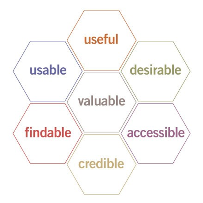
Information architecture and UX expert Peter Morville expanded on the concept further when he created his now-ubiquitous UX Honeycomb (pictured below) over 15 years ago. It’s rare we’d cite something so old, but the foundational elements of this infographic have remained evergreen despite new tech.
https://semanticstudios.com/wp-content/uploads/2004/06/honeycomb.jpg
Morville explains how information must be optimized to suit each of the honeycomb’s individual facets:
- Useful: Your content should be original and fulfill a need
- Usable: Site must be easy to use
- Desirable: Image, identity, brand, and other design elements are used to evoke emotion and appreciation
- Findable: Content needs to be navigable and locatable onsite and offsite
- Accessible: Content needs to be accessible to people with disabilities
- Credible: Users must trust and believe what you tell them[3]
To make things a little more specific, here are a few metrics users commonly address when describing their experience:
- The time it takes for the website and landing pages to load
- The availability of customer support
- Tone of the copy on the website as well as color selection
- How well the site functions
- Marketing content on the site
- The manner in which financial matters are presented[4]
Importance in Healthcare
UX needs to be in tip-top shape to encourage users to choose your organization (and stick with it), but it takes more than that.
Education
The theme of consumerism and the discerning customer echoes throughout every corner of healthcare marketing, and organizations must be ready and willing to provide additional benefits to prospects if they wish to convert them to revenue sources. With the complexity of both the healthcare system and health issues in general, serving as an education resource helps build trust and credibility with prospects, supplying them the information they need and providing the comfort that they have a resource that is equipped to do so.
Jonathan Cately with Medical Marketing Insights writes, “Today, patients are more ‘active’ than ever before — while the knowledge-gathering stage in the traditional path to treatment was limited to consultation with friends and family, patients are now taking an increasingly active role in educating themselves and making their own decisions about their treatment options. The internet has played a major role in this shift, giving patients access to limitless educational resources that once were accessible only by direct consultation with a medical expert.”[5]
It may take some extra effort, but integrating these opportunities for education into your marketing efforts is a mutually beneficial proposition. You may have to bulk up content on the pages of your website in order to answer consumer questions before they ask, but this also presents an opportunity to optimize that web page for search engine rankings.
Pages with less than 300 words are considered “thin” by some search engines, so adding this content will make your page more visible in search results while including natural-sounding keywords, which helps prospects organically find your site.
Emotional/Human Connection
Healthcare can be a stressful, nerve-wracking area for consumers to navigate, whether that’s research, dealing with insurance or administrators, the treatment itself, etc. Because of this, including human elements in marketing efforts can go a long way in capturing prospects’ attention, disarming them and gently guiding them into your sales funnel. Your website or marketing emails may have all the education in the world, but if it’s presented in a way that’s dry, robotic or bureaucratic, readers can be easily turned off from your brand.
We understand that this humanization occurs on a sliding scale, and that warm, conversational copy does not suit every brand. For example, we don’t recommend that a highly prestigious management consulting firm go sending out Baby Yoda memes in its newsletter, but we would recommend framing copy as sympathetic or understanding, for instance:
“Our firm provides middle-management training that improves revenue. Participants will learn management skills and how to apply them.”
Vs.
“Sometimes skilled managers struggle to apply their knowledge effectively, which can affect your bottom line. Our middle-management training course helps your staff achieve and replicate success on their own.”
Areas of Focus
Below are a few tips and areas of focus when it comes to putting the consumer first in your marketing efforts:
Mobile Optimization. Make sure your website, ads and emails are all designed for both mobile and desktop use and access. In fact, if you had to choose one, mobile is more important than desktop as Google recently began analyzing mobile sites first due to the migration from the latter to the former as the most-used way to access websites. Be sure to test your efforts on computers, phones and tablets. For the mobile devices, examine every page in both landscape and portrait modes, and try filling out every web form to make sure they work.
Layout and Navigation. Minimalist web design can look great, but it can also pose many UX problems, especially between desktop and mobile. For instance, hiding the menu may give the site a “cleaner” appearance, but it can also frustrate users who are simply looking for information in a direct and straightforward way. This can increase your bounce rate.
Create a Path of Least Resistance. Consider what information a reader would most wish to see on a page, and what information you most want them to see. Then, make sure both are displayed in a way that immediately engages them and catches the eye. For example, a medical device manufacturer may have a “Specifications” page for its latest diagnostic system. Include the specs plainly above the fold. Then, consider the desired action – request a demo or download a whitepaper, for instance. A tastefully colored CTA button next to the specs or a bar beneath the site menu are two ways to provide the information readers want while making it easy to take the next step down the sales funnel.
ABU (Always Be Updating). It’s rare that a “set it and forget it” mentality is productive in marketing, and UX is no exception. For example, websites need frequent updates and testing to quickly load and properly function. (Think of how an iPhone 4’s operating system would run in the year 2020). If site components start to lag or the site starts failing, even in a single area, UX could plummet and prospects could be driven elsewhere. Also, remember you have a great resource for determining if consumers are having a positive experience: the consumers! User surveys can help uncover what’s working and what’s not. Deliver user experience surveys via email or a post-purchase popup on your website.
***
Optimizing every inch of your marketing efforts to suit consumers may seem daunting if it wasn’t already a priority, but the payoff for your organization can be enormous: increased users, additional repeat users, stronger word-of-mouth awareness, better reviews, improved SEO, the list goes on. Just think, you are a consumer. Think about what worked for you. Can you remember a time when user experience has made you mentally tell off a healthcare company, or an example where you said to yourself, “Wow, this company really gets me”? Let us know what they were in the comments below.
Big Buzz is a marketing agency delivering a steady stream of move-in-ready leads to teams serving the senior living industry. For more than 15 years, Big Buzz has helped senior living marketing and sales teams nurture leads to increase occupancy, grow and scale. CEO Wendy O’Donovan Phillips is the author of the book Flourish!: The Method Used by Aging Services Organizations for the Ultimate Marketing Results, has been published in McKnight’s, has been a regular contributor to Forbes, and has been quoted in The Washington Post, ABC News and Chicago Tribune. The Big Buzz leadership team regularly lectures in front of audiences ranging from 25 to 3,000 attendees, including at Argentum and various LeadingAge chapters. Agency awards and accolades include recognition for excellence by the American Marketing Association, Gold Key Award Winner by the Business Marketing Association, HubSpot Academy Inbound Marketing Certification, and Top Advertising and Marketing Agency by Clutch.
[1] https://www.mpo-mag.com/contents/view_online-exclusives/2016-09-13/5-considerations-for-human-factors-testing/
[2] https://www.usability.gov/what-and-why/user-experience.html
[3] http://semanticstudios.com/user_experience_design/
[4] https://www.targetmarket.com/healthcare/importance-user-experience-medical-website-design/
[5] https://www.mdconnectinc.com/medical-marketing-insights/medical-marketers-patient-education[